• Greetings, Agents! Welcome to the The Division Forums. It looks like you're looking forward to Tom Clancy's The Division 3, but haven't created an account yet. Why not take a minute to register for your own free account now? As a member you get free access to all of our forums and posts plus the ability to post your own messages, communicate directly with other members and much more.

UI Change

Status
Not open for further replies.

WolfgangRG

New member
I am wondering why has the UI changed so much! I personally want the first UI, map and menus shown with the watch being the menus and all of that. If it doesn't have an option to go back to that menu, map, and UI, I hope someone will make a mod for it if that will be allowed for modding that in without me getting banned. Because I wanna know why they changed it and if there will be an option to have it like how it used to be in the first E3 presentation.
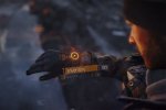
image.jpeg

 
Last edited by a moderator:
We'll never know why exactly.

As with all features in a game: They have a meeting, they give ideas, they create those ideas and then they decide which way they go. I'm pretty sure they've did extensive testing on this and went with this route because it might've felt more intuitive, or easier to navigate.

 
Yeah, I personally feel the watch menu is easier to use and actually look better. The map might be easier how it is now but I still would rather the map they showed in a the presentation, the menu changes really screw with my immersion. But hey. Hopefully they'll allow someone to mod in the previous menus if they don't give us the option

 
to me the old UI did look very cool. but having played the beta, and the way the UI is now, i guess you can call it a tabbed system. press one button and all your choices are right on one screen.  i think the scrolling menu on the watch like in your picture, would have been a little bit of a pain after awhile. especially if you had to make quick changes to your load out. Like DiR3 said. they probably tested it and came to the conclusion it wasn't practical. We will never know the reason for the change.

 
to me the old UI did look very cool. but having played the beta, and the way the UI is now, i guess you can call it a tabbed system. press one button and all your choices are right on one screen.  i think the scrolling menu on the watch like in your picture, would have been a little bit of a pain after awhile. especially if you had to make quick changes to your load out. Like DiR3 said. they probably tested it and came to the conclusion it wasn't practical. We will never know the reason for the change.
You bring up a very good point. There is no pause in The Division. If you're under fire and quickly want to change weapon loadouts the scroll menu from the picture above would take too much time. However, I do find the inventory system a bit unintuitive and hope they will allow mods for this in the pc version. 

 
You bring up a very good point. There is no pause in The Division. If you're under fire and quickly want to change weapon loadouts the scroll menu from the picture above would take too much time. However, I do find the inventory system a bit unintuitive and hope they will allow mods for this in the pc version. 
yes, you are right, im sure there will be someone out there that will have mods for it, they always do. I do like that they have the option where you can at least move things around.

 
What you said with how the menu might be tedious I will agree it could be but it's could have the same where you have the option to push one button on PC and it pops up the specified menu (example Inventory I think was "I") so that solves that problem and on console they still had to take the effort to go to the tab like group management or inventory in the same effort- sorry if it sounds Ike I'm starting a debate just wanted to say I feel they both are equally efficient but the first one looked better so I very much hope to have access at release for this menu, cause I'm not sure if someone will make the mod I hope they do but I know I can't because I don't have the ability or skill haha! Hope they give the option for different style menus. Like some games have styles I'd love that! I hope Ubisoft is seeing this haha! Cause I hope they still have the stuff for the different style menus so you could choose your favorite, that'd make many people happy I bet!

 
What you said with how the menu might be tedious I will agree it could be but it's could have the same where you have the option to push one button on PC and it pops up the specified menu (example Inventory I think was "I") so that solves that problem and on console they still had to take the effort to go to the tab like group management or inventory in the same effort- sorry if it sounds Ike I'm starting a debate just wanted to say I feel they both are equally efficient but the first one looked better so I very much hope to have access at release for this menu, cause I'm not sure if someone will make the mod I hope they do but I know I can't because I don't have the ability or skill haha! Hope they give the option for different style menus. Like some games have styles I'd love that! I hope Ubisoft is seeing this haha! Cause I hope they still have the stuff for the different style menus so you could choose your favorite, that'd make many people happy I bet!
after playing with the settings on the PC version, i do believe it has been totally redone to the system that is place now from the earlier one you like. with 28 days till launch of the game, im sorry to say that i think we are stuck (for now) with the system that is in place

 
Honestly that watch menu while it looks cool is completely inefficient. After the initial coolness has worn off, you would be constantly frustrated by having to scroll through the options to get to your menu you want or if you're on the PC you would have a hotkey assigned to take you directly to the menu and would bypass that all together. 

 
I think the simplest answer as to why they changed it is ease of use. The old menu looked cool and everything, but if you imagine scrolling through every single skills, perk, talent, and the mods. Plus the weapons and inventory. Talk about sluggish and annoying. The newer one isn't as immersive. But its extremely functional. 

 
I think the simplest answer as to why they changed it is ease of use. The old menu looked cool and everything, but if you imagine scrolling through every single skills, perk, talent, and the mods. Plus the weapons and inventory. Talk about sluggish and annoying. The newer one isn't as immersive. But its extremely functional. 
Functionality and Efficiency  > Looks and Design

Everytime

 
Status
Not open for further replies.

Advertisements

Back
Top